Help - Search - Members - Calendar
Full Version: Portrait Obsession
The Black Wyrm's Lair - Forums > Mod development resources & discussion > Modder's Studio of Arts
Pages: 1, 2, 3, 4, 5
Rabain
I have been messing around with Photoshop all day...I guess I am a little obsessed with portraits at the moment.

Anyway to take my mind off choosing portraits for NPC mods I have done the following. Each image is taken from various locations around the net, mainly Poser art sites. The armour and such are various cobbling together of bits and pieces from BG2 armour and some other BG2 portraits already available.

Let me know what you think:


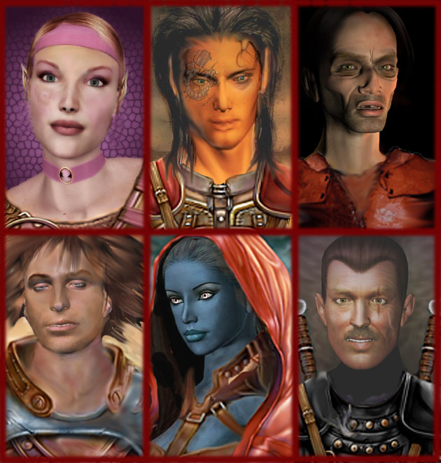
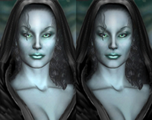
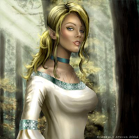
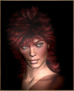
Top-Left - she wasn't so pink, didn't have the elf ears, didn't have that birth-mark/tattoo type thing and didn't have the armor.

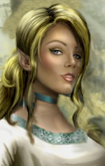
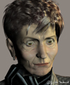
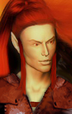
Top-Middle - he didn't have any armor, no clothes at all in fact, didn't have the tattoo or the elfish ears and the hair was so dark you almost couldn't see it at all!

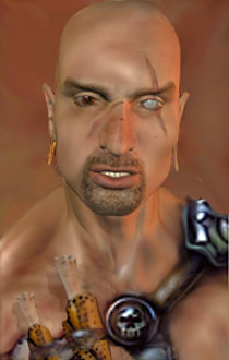
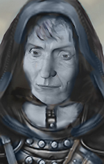
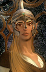
Top-Right - all this guy had was a face and only about half the neck you see now. I extended the neck and added the worn armor. Might make a decent villain.

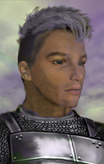
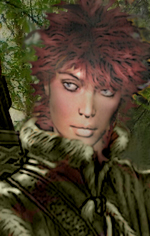
Bottom-Left - again this guy was just head and short neck. I added the armor, recoloured it blue and red tint, lengthened his neck using the smudge tool. Also he was paler than the elf girl above so I gave him a tan by using a skin graft from another portrait and smudge it in. There is still something odd about this one..the eyes?

Bottom-Middle - she wasn't a drow and had no clothes on! I think the leather straps might still need some touching up...but don't they always!

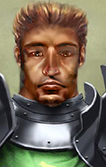
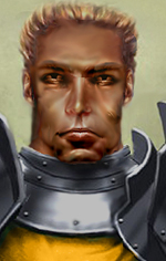
Bottm-Right: he was just a head wearing a black polo neck, I had to give him a different background to highlight his hair, added the armour which fitted nice with the polo, copied the sword handle to the left side. Might make a decent Armsmaster for some Duke. Gave him the scaring too.
Baronius
Perfect work. They're simply perfect. Go ahead! What about a collection called Rabain's Portrait Pack?
Awake
Good job. I'd have to say my favorite one up there is the drow.

Bottom-left: ....he looks like a stoner.... herb.gif laugh.gif That's what he reminds me of. Perhaps he could be some guy addicted to Black Lotus? blink.gif
Rabain
QUOTE
Perfect work. They're simply perfect. Go ahead! What about a collection called Rabain's Portrait Pack?
Heh thanks, the plan is to have around 20 or 30 portraits done from the images I have downloaded. This is the first 6, maybe someone from the WTP or LC might have use for some of them. I do them as much to give myself a break as actually needing portraits. I have started making them all in the large 210x330 format as they are easier to edit and can be used for the Epilogue Portraits should need ever arise.

QUOTE
Bottom-left: ....he looks like a stoner....  That's what he reminds me of. Perhaps he could be some guy addicted to Black Lotus?


LoL , I just knew there was something about him...damn stoner's. New NPC mod idea forming...Stoner Kit...he's a lover not a fighter man...through the course of the game you have to feed his habit by spending increasing amounts of money on buying black lotus!
jastey
Not bad. smile.gif

I like the pink lady best. She's perfect.


Oooookay some critic, I hope it's helpful to give you a new perspective on the pics (from drawing I know that oneself looses the objective view on the own picture sometimes):

The left guy on the top line has a too long neck IMO, and for a BGII portrait the head is too small on the picture.

top row, middle: His left eye (on the right side) looks strange: I would expect the pupil to be bigger, more black. The eye has a light (blue) spot where I would expect the black of the pupil to be.

The man on the right in the bottom row has a too long neck, too. IMO. The neck looks a bit strange too: on the one side the line goes from shoulder to ear, on the other side only to his chin - do you see what I mean?

The stoned guy... (Now I know why you suggested that "smilie", Awake tongue.gif) I like his face very much, actually. I would like to see him not with flying hair but with a normal haircut, or (preferably) wearing a helmet, and with awake eyes. The head a bit bigger on the pic, in full (now it is cut on the forehead.) I know to make the eyes is a hard thing, but if you'd like to play with that one some more I would be curious to see the result. smile.gif (I'm always looking for alternate portraits for Ajantis... )
Rabain
Jastey...both my biggest help and my biggest critic...just to answer some of the criticisms:

the guy on the left (your right?) has a long neck and a small head...that's it...he is very sorry but he was born that way!

yeah the middle guy's eye is a bit odd but then you wouldn't notice that on the smaller portraits...actually flaws are a lot easier to spot on these large versions!

Yeah the guy in black's neck looks a little odd, he is turned slightly if you look carefully but I didn't even notice the neck thing..you must have some super monitor to see these things!

I'll see what I can do with the stoned guy, it is very hard to find decent helmets to add to portraits.

Here are the next three portraits, in much the same style as the others. I am trying to get a range of classes too instead of the usual fighter/elf/drow options:


Okay the girl on the left is what I call a cleric, her eye makeup probably needs fixing but I don't have much experience with makeup!

The mage girl picture I loved because of the hands, you don't see hands much in BG portraits so I really wanted to keep them. The only problem was the original image only had the face and hands, no arms beyond the wrists. So I found some girl online and stole her arms, I think they have turned out okay, the robe cuffs were a last minute addition which i think was pure genius as they make the arms look like part of the picture...I like this one!

the guy is a bard, I can just see his big head booming out a deep tenor in some Inn in Trademeet!

I am going to have to trawl for some new armors and clothes etc as the original BG portraits are getting a little old, I feel like i am seeing the same armour/robes all the time now!

Please remember too that there is even more detail in the bmp images than in these compressed jpg's!

Comments?
jastey
Those are great! smile.gif
I like these ones better for BGII than the first ones, as they look like original BGII style!

The cleric and the bard are just perfect. wub.gif To the make-up: Try to keep the blue between eyebrow and eye, it's spread a bit too far to the side (if you know what I mean.)

The lady with the hands: It seems to be destiny that I have the most critic on the one you like best, well.
Chest region: Somehow doesn't look right. The collarbone is too far down and should be more to the right (my right, her left, and this time I mean it.)
The region where the neckline starts has shadows that make it look as if there's a bone of some sort (which surely isn't...)
The head: I miss some "volume" here. the head (the hood) should rise higher IMO. Compare with the cleric how "high" the head rises from the forehead: This is missing here, do you see what I mean?
Nitpick: Her right arm (the one on the left side...) seems to be bended / curved. Make the upper part of the arm (starting from the back of the hand) a straight line.

Rabain, I really don't post my criticism to annoy you. But I will always tell you what I think looks wrong in the pictures you show me... and hope it is helpful. And that you won't stop showing them to me. smile.gif


QUOTE
the guy on the left (your right?) has a long neck and a small head...that's it...he is very sorry but he was born that way!
laugh.gif OK that's a valid explanation. (With head too small I meant that the cut-out of the picture is different than of the usual BGII-portrait, where the portraits are chosen in a way that the head size is mostly the same, and for consistency I like it that way.) And yes, I meant on the right, of course. rolleyes.gif
Rabain
QUOTE
Rabain, I really don't post my criticism to annoy you. But I will always tell you what I think looks wrong in the pictures you show me... and hope it is helpful. And that you won't stop showing them to me.
No worries , I never take anything too seriously!

QUOTE
Nitpick: Her right arm (the one on the left side...) seems to be bended / curved. Make the upper part of the arm (starting from the back of the hand) a straight line.


I look at this and it looks odd and then I look again and it looks okay, I don't want to mess with it too much in case I wreck it completly! The oddness I guess comes from using two different hands/arms at different angles and joining them together. I'll redo them all later and post them again. While I am going I might as well try to get a good few done (I get bored easily doing the same thing all the time)..if i come back to it in a week or so I should be interested again.


I have made some slight changes... as above!
jastey
The hand is better now. The chest region still doesn't feel right... But I don't know how it should be. I think I would try covering it a bit more with the coat... only a suggestion.

Did you change the makeup (of the cleric?). smile.gif If only I knew what for, I would take the cleric and the bard pic right away. smile.gif Unfortunately I'm in no need of portraits right now (except alternative Ajantis portraits...)

Looking foreward to seeing more pics!

EDIT: Wow, I just saw the originals on FW - it's magic what you've done to the cleric! I like your version so much better! thumb.gif
Rabain
Yeah changed the eye makeup and made her eyes blue, I felt it fit more with the blue sky and shoulder pads. There is too much Green in BG portraits!

There wasn't much to change for the bard really...I just like the facial expression!
Awake
I like the middle one a lot. The only problem I see with it is that her hand looks...hairy? laugh.gif Looks good though. Good job. I'll go check the originals at fw.

Oh, and about Jastey being so damn picky...well, I'd ban her... tongue.gif
Rabain
Okay here is tonight's effort:


I'm not sure about the knives but i wanted something different to the usual BG stuff.
Sir-Kill
does not look like you want to f*** with him
jastey
But he doesn't look unfriendly, it's a real warrior... no? Pity about the eye, though...

Not bad! smile.gif

OK, and because you guys expect it: His right shoulder looks a bit weird. I think I know which muscle that would be, and for such a strong man I guess it's OK if it's really big, but I'm missing the actual shoulder there. (Awake: *you* try banning *me*, dude tongue.gif)

With knives you mean the two things on the belt? On my display I couldn't tell it's knives. i took it for some sort of tribal decoration... sorry.
Rabain
I have moved this to Graphics Department for a little more exposure and I think I am ready for the criticism!

It's funny but the images on my home PC are a lot darker than they display here at work. My settings at home are max Brightness & Contrast and still it is a lot darker than what I see here!

I will have to darken these somemore as they look better than they do here...really!
jastey
Even better? blink.gif

I think I figured out about the guy's shoulder: The muscle is OK, but it seems to start behind the neck, not from it... see what I mean?
Rabain
I darkened the image somewhat..I think it looks better. What do you think?

Also the muscle thing looks better..at least on my monitor it does! I think this is to do with the fact that his shoulder has dissappeared..you can barely see it in the original..it's gone in my edit!

It is kind of hard to tell now on my monitor as something looks really dark and then when i see it on another monitor its as bright as day...what am i to do?
egm
What nice portraits smile.gif
jastey
QUOTE(Rabain @ Mar 11 2005, 12:14 AM)
the muscle thing looks better..

Way better! smile.gif
QUOTE
I darkened the image somewhat..I think it looks better.  What do you think?
I can't really tell... Guess I'm sitting on one of those "bright as day" displays, too.

QUOTE
It is kind of hard to tell now on my monitor as something looks really dark and then when i see it on another monitor its as bright as day...what am i to do?
Buy a new monitor? tongue.gif No idea, really. It's weird how different some monitors show the images. That's one of the things I don't like about doing computer art!
Sir-Kill
I was looking at this guy and his neck muscles never looked right, thinking that the angle was off I strightened it out a bit.
Rabain
I think with the shoulders that straight he no longer looks as muscular and his head looks a lot smaller compared to his body!

Jastey was right about his neck too...it almost looks like there is someone with bigger shoulders standing directly behind him! (not just yours but my version too!) I guess he is just a freak! laugh.gif
Sir-Kill
well he is missing the top of his dome, but it might be a bit more proportional.
Rabain
Hi Guys,

So I have finally gotten around to creating a BWish Portraits page for my edits:

Rabain's Portrait Edits

I will add more as I get them done.

Enjoy!
jastey
I'm looking foreward to seeing more added from time to time. smile.gif
Deathsangel made a good choice there: Pity that one is taken!

Just a comment: It would be nice to see the reserved ones without the red cross, too. I think if you write it beneath the picture it should be clear.

I like the Sir Neht one very much!
Rabain
The thing is I don't want people using the images that are reserved but I want them to be able to see what can be done so this is my trade off. You can see enough of the image to get the idea but unless you are decent enough with photoshop or some other editor the red X should be enough of a turn off.

Okay here is tonight's effort (aptly called midnight), what I need feedback on is which looks better to you, left or right? I am having a bit of a problem these days deciding as several people have commented on portraits needing to be darker but they look just fine to me. My vote goes with the left one but perhaps this looks too bright on your monitor (?) ...let me know.


if only they were twins...
jastey
The pics are both about the same brightness on my display, but the left one has a little higher contrast, which makes her look as if she stands in a spot light of some sort. But, due to that, the left one looks more interesting and it is not too bright.
Nice work! smile.gif
Sir-Kill
the lips and neck are too bright on the left, so I say right smile.gif
Rabain
Okay then here is tonights effort:


I'm not too sure about the armour against the skin ( I use the smudge tool too much!)
Sir-Kill
looks good! I see what you are talking about it kind of looks like the shirt/padding is showing, I say leave it. smile.gif have you tried the soften brush/tool instead of smudge, it does not push the color around
Rabain
It's weird, I am looking at this at work and I can see much more detail than I can on my monitor at home, that whole area on his right shoulder (his left) is black, I can't see the strap going over the shoulder like I can here!

I tried to make a purple hue on the left side of his face (your right) and it just looks like a poor attempt at staying inside the border (like a 5 year old with a crayon)

Oh and the shirt looks like it sticks out (which I cannot see at home at all as this area is completely dark). Looks like i need a new monitor as all the brightness/contrast settings are on high at home (or new drivers for my card? anyone know if this makes a difference to such things?)

I haven't really experimented with many of the tools yet in photoshop, I must give that a go, thanks!
Rabain
I can't really say this is something I have made up as I have changed very little. I shortened her neck somewhat so I could get her bust into the portrait (ahem!) though it still looks fairly long but it kind of fits with the body as seen in the original below.

Unfortunately with BG portraits you don't get to see much of the rest of the body to give you proper proportions (and man does she have proportions...)


kudos to the original artist Kimberley Atkins for a portrait that doesn't really need alteration!
Rabain
And in total contrast to the above:


Matron Mother says..."Come here you young surfacer and I'll teach you something you won't soon forget. You'll have the marks of the Drow Lust Pits on your skin for the rest of your short life!"


from this:

Sir-Kill
intresting, it does fit in with a matron mother, are you coing to color it?
Rabain
Er...that was the coloring!

I recoloured the skin using a drow skin tone from another BG portrait...and got rid of the brown leather straps and made them grey/brown instead.

I guess it does look black and white, I could probably make her skin more purple to make it look less black and white...how does it look now ^ ?
Sir-Kill
yeah, yeah, thats much better
Rabain
Thanks SK!

This is one I did yesterday...I'm not too sure about it...perhaps it is because I pulled together 3 distinctly different images to get this. I was looking for something a little different to the normal armour/leather/hood portraits (it is just so easy to use existing portraits as a base...too easy).

Anyway here she is, could easily be made into an elf by pointing the ears:


and the original:

Awake
QUOTE(Rabain @ Mar 25 2005, 05:26 PM)
I can't really say this is something I have made up as I have changed very little. I shortened her neck somewhat so I could get her bust into the portrait (ahem!) though it still looks fairly long but it kind of fits with the body as seen in the original below.

Unfortunately with BG portraits you don't get to see much of the rest of the body to give you proper proportions (and man does she have proportions...)


kudos to the original artist Kimberley Atkins for a portrait that doesn't really need alteration!

Well, I like it. I would actually like to steal that one, if I may. I have a few elves(a whole city...) that need portraits, and I have been searching for a good female elf for a while now. May I reserve this one, please? smile.gif

BTW, you're doing a great job, and I really like those drows that you did on the last page(I think).

I never got around to posting it, but I loved your St. Patty's day portrait as well. Nicely done thumb.gif
jastey
QUOTE(Rabain @ Mar 25 2005, 02:21 AM)
Okay then here is tonights effort:


I'm not too sure about the armour against the skin ( I use the smudge tool too much!)

What I'm missing here is more light and shadow in the face, compared to the shiny armour. Of course a polished armour shines more brightly than a face but still I would assume that the light source that lets the armour shine should light the face a bit more, too. (I guess I see it more light than you do on your monitor at home...)

Otherwise the pic is great, no comments on proportions and stuff. smile.gif

Blonde elf: smile.gif Cute. Well, I guess I could make some comments on proportions here but I don't want to sound jelous. tongue.gif

Matron mother: I like the pic, I think the colours are matching for underworld (and I never thought it's black and white), yet I have problems to see the face as a drow face - looks like an old human woman to me (I don't know, the nose? The eyes? I would imagine drow to look more "elfish", whatever that means...)

Red haired woman from yesterday: What I don't like here are the colours of the picture, they look a bit surreal. Everything else is great, the coat (something special indeed), and the woman itself, no critical comments there. smile.gif
Baronius
The blonde girl is nice! The old woman will be a perfect portrait for a drow matron. thumb.gif
As far as the red-haired woman is concerned, I have to agree with jastey. The picture is not plastic, not natural enough. However, I must add that the source picture in advance doesn't look too ideal for further editing.
Rabain
QUOTE
Awake: Well, I like it. I would actually like to steal that one, if I may. I have a few elves(a whole city...) that need portraits, and I have been searching for a good female elf for a while now. May I reserve this one, please?
She's yours then...I've already had my...way with her! smile.gif

I'll be working on more elves soon, if you want to suggest some types I'll have look around for some decent faces to portraitify (?)

QUOTE
Jastey: What I'm missing here is more light and shadow in the face, .......(I guess I see it more light than you do on your monitor at home...)
Otherwise the pic is great, no comments on proportions and stuff.

Yeah the old monitor thing is doing my head in, I darken the images down a good bit before posting them just to avoid this for others though they look very dark on my screen! I like the proportions here too, thanks!

QUOTE
Jastey: Red haired woman from yesterday: What I don't like here are the colours of the picture, they look a bit surreal. Everything else is great, the coat (something special indeed), and the woman itself, no critical comments there.

Baronius: As far as the red-haired woman is concerned, I have to agree with jastey. The picture is not plastic, not natural enough. However, I must add that the source picture in advance doesn't look too ideal for further editing.

I think a lot of the problem is because I made the coat green, perhaps I should add some brown on the fur to accentuate it a bit more (?) Overall I like the high collar on this coat, it is kind of stylish too!

Oh and there are some arrows sticking out of a quiver on her shoulder..can people see that...it just looks like a black lump on my screen..how about yours?

Thanks all for the comments...suggestions are welcome (for both new portraits and changes to existing) or if you happen to come across some good headshots on your web travels point me towards them!
Awake
QUOTE(Rabain @ Mar 27 2005, 03:28 PM)
QUOTE
Awake: Well, I like it. I would actually like to steal that one, if I may. I have a few elves(a whole city...) that need portraits, and I have been searching for a good female elf for a while now. May I reserve this one, please?

She's yours then...I've already had my...way with her! smile.gif

I'll be working on more elves soon, if you want to suggest some types I'll have look around for some decent faces to portraitify (?)

laugh.gif

Hmmm... Well, my realm is of wood elf types. So, if you can, just some lighter skinned ones. Drow will go to someone else.

thumb.gif
Rabain
Here's a wild elf type I have had lying around, I could baldurize the skin a little if it is too picturish for you:


And just now finished (not much to do with this), had to make it presentable in the close up image:

Rabain
Okay I have spent the past 2 hours doing this...I like it though it does look a bit odd for some reason...it is an attempt to take the helmet off Ajantis and show him in a different pose:


Jastey I know will have some comments...probably about hair colour or something! biggrin.gif
Awake
QUOTE(Rabain @ Mar 28 2005, 01:25 PM)
Jastey I know will have some comments...probably about hair colour or something! biggrin.gif

As my friends and I would say, ROFLSAUCE.

The comment might actually be on the lack of neck, but that's just me.


I like those elf portraits as well. Especially the male. It seems pretty difficult to get male elf portraits, as well sad.gif

The female portrait does have one slight problem. The...err...gem(?) in the helm is kind of different then the rest.
Rabain
I think the neck is fine, better as it is than too long as most of the other portraits end up being! Armour tends to make guys looks dumpy anyway...

As for the elf girl...it really must be a monitor thing because the gem is one of the few things I actually added to this portrait! I made an effort to try and blend it in, even get the lighting right! I thought her helmet was lacking something. perhaps I need to darken it down some more (the gem) or perhaps just get rid of the white dot on it which tends to draw the eye to it.

the next portrait will be a topless one so no one will be distracted by minor inconsistencies like gems and such... ohmy.gif
Awake
You're right, it looks like it's the white dot that does it.

I'm looking forward to this topless one. No lopsidedness, mm k? blink.gif


laugh.gif
jastey
QUOTE(Rabain @ Mar 28 2005, 11:25 PM)


Jastey I know will have some comments...probably about hair colour or something! biggrin.gif

First let me say that it's great to see you dealing with Ajantis alternate portraits! smile.gif

I have to admit that I have some problems with the picture, it looks somehow wrong. (The fact that he looks totally different than I thought is another thing tongue.gif)
My comments:
His left eye lacks some contrast, expecially compared to the other one. (What is his eye colour? His right eye seems to be blue, and the left one appears brown on my display.)
The head is a bit too short, starting from the eyebrows: I would expect his forehead to be longer/ wider (being so short makes him look a bit dull, if you know what I mean.)
His chin is very unique... maybe soften the angular shape a bit (I don't mean making him more feminine, though.)
Another point is the armour: If the green one is supposed to be a coat, I would expect it to be on top of the armour. The way it is right now it looks as if he is only wearing a metal necklace or something.

I'm very tired now so sorry if the post is a bit short.
Rabain
If you look at the original you can just about see he has brown eyes. Because he is not looking at the camera in the original I had to steal somebody elses eyes! I can improve the colour, I am in work right now and it does look odd...the monitor thing again!

His forehead was a lot larger but I thought he looked like a half-orc so I shorteneed it, this can be fixed also!

I can lengthen his neck too..but it will look odd...I swear.

With the armour, this is the way knights armour works, you wear chainmail underneath, then a tabard (which is the green above, it usually has the symbol of your order or house on it) and then shoulder or neck plate. This was the norm for mounted knights.
jastey
Now at this monitor the eye looks better than at my display at home. smile.gif Just in case you can't see what I was talking about.

EDIT: Didn't see your post.
QUOTE
I can lengthen his neck too..but it will look odd...I swear.
I think I have no problem (ohmy.gif ) with his neck, it was Awake who said it's short (I think) tongue.gif
QUOTE
With the armour, this is the way knights armour works
Ah, OK, then make it a golden colour, please. (Ilvastarr's family coat of arms: http://www.nctimes.net/~bryonw/heraldry-ilvastarr.htm )
Rabain
Version2


Jastey if you have a nice dragon head I could either put it on this armour or onto the orange tabard but the Family Coat of Arms on that link you gave is just so bad it's not worth it...I get the colours and the idea but I can't really see any Ilvastar going around with a dragon that badly drawn on their shields/armour/clothes!

Maybe there is a decent dragon head in the Draconimicon? Any colour dragon will do as I can recolour it!
This is a "lo-fi" version of our main content. To view the full version with more information, formatting and images, please click here.
Invision Power Board © 2001-2024 Invision Power Services, Inc.