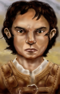
Full Version: Halbo's New Portrait
The Black Wyrm's Lair - Forums > Mods under development - Baldur's Gate II > Inactive and waiting projects > Halbo NPC
I decided to scrap the previous three portraits I had. Thanks to flysoup for making the new portrait for me.


That's one moody halfling... 
Well, he's not exactly a moody character even if he looks it. Shady is the term I would use.
I am not sure if it's my screen, but the portrait looks to be of an awful quality. I can see an unmasked outline of the photograph pasted on the excessively bright background, and the resolution is nowhere near BG, it's really grainy. If I may make a suggestion, if the portrait has the mood and the character vibe you like, ask someone to re-edit it for you.
there was some pretty rough jpg compression there. and maybe a few things that were not to design or maybe it was, either way I made some changes.Mainly I tried to de-chunk him
Domi: I'll be the first to admit that I fall way short of being an artist, plus that I lack any real experience with computer graphics. I did the best (ok, maybe not best, but I tried anyway) I could with a VERY outdated program. I'm generally not one to specifically ask someone to do something for me which is why I never requested an improvement. Volunteers are accepted though. 
As for the color, I'm not sure what you mean by calling the background excessively bright. When I put it next to the original Bioware portraits, it is considerably darker than they are. Perhaps you meant that it is very saturated with color? Or maybe it is your monitor (or mine).
Sir-Kill: Thanks for you edit of the portrait. It really does look much, much better. I have no idea about how to properly compress JPGs (although the one I loaded is a BMP) or anything like that, so that would probably explain why it looked so bad. Actually, the portrait looked pretty good to me at 2 AM when I was working on it. The eyes probably weren't working right at the time.
n/p didn't have much to do at work at that moment.
about jpg never use it if it is something you want to keep. png is about 1/2 he size of a bmp and both are lossless.
about jpg never use it if it is something you want to keep. png is about 1/2 he size of a bmp and both are lossless.
QUOTE
about jpg never use it if it is something you want to keep. png is about 1/2 he size of a bmp and both are lossless.
The original pictures that I used to edit were originally JPG. What your saying is that they lose quality when switched to another format?
every time you save jpg it looses quality (unless you change the options to lossless)
yeah most all images on the net are jpg, and most of those are pretty heavily compressed. so if you snag an image off the net and doe some editing on it and want to keep it, maybe even edit it again, it is just best to use png (sk loves png) or keep the jpg compression to about 4 and the unless you have an option (as paintshop has) for croma sub-sampling (sp?) and that is set to 1 then you can go higher, but for portraits why bother they are small either way.
yeah most all images on the net are jpg, and most of those are pretty heavily compressed. so if you snag an image off the net and doe some editing on it and want to keep it, maybe even edit it again, it is just best to use png (sk loves png) or keep the jpg compression to about 4 and the unless you have an option (as paintshop has) for croma sub-sampling (sp?) and that is set to 1 then you can go higher, but for portraits why bother they are small either way.
Updated with flysoup's great piece of art. Halbo now looks much more fit to be implemented into Baldur's Gate!
Much better.
Grand.
This is a "lo-fi" version of our main content. To view the full version with more information, formatting and images, please click here.
