| The Black Wyrm's Lair Terms of Use |
 Help Help
 Search Search
 Members Members
 Calendar Calendar
|

  |

 Mar 28 2005, 12:27 AM Mar 28 2005, 12:27 AM
Post
#41
|
|
|
The Raven  Mod Developer Posts: 590 Joined: 4-September 04 From: California, USA |
QUOTE(Rabain @ Mar 27 2005, 03:28 PM) QUOTE Awake: Well, I like it. I would actually like to steal that one, if I may. I have a few elves(a whole city...) that need portraits, and I have been searching for a good female elf for a while now. May I reserve this one, please? She's yours then...I've already had my...way with her!  I'll be working on more elves soon, if you want to suggest some types I'll have look around for some decent faces to portraitify (?)  Hmmm... Well, my realm is of wood elf types. So, if you can, just some lighter skinned ones. Drow will go to someone else. 
-------------------- And can we finally say that the bhaal spawn idea has had the final nail hammered in its coffin?
Member of the World Transition Project And the raven, never flitting, still is sitting, still is sitting On the pallid bust of Pallas just above my chamber door; And his eyes have all the seeming of a demon's that is dreaming, And the lamp-light o'er him streaming throws his shadow on the floor; And my soul from out that shadow that lies floating on the floor Shall be lifted - nevermore! Like dealing with terrorists by giving them explosives |
 |
|


|
Mar 28 2005, 06:55 PM
Post
#42
|
|
|
GOD Retired team member Posts: 1728 Joined: 14-July 04 From: Ireland |
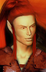
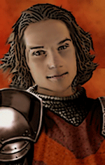
Here's a wild elf type I have had lying around, I could baldurize the skin a little if it is too picturish for you:
 And just now finished (not much to do with this), had to make it presentable in the close up image: 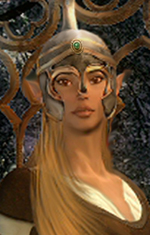
|
|
|
|
|
Mar 28 2005, 09:25 PM
Post
#43
|
|
|
GOD Retired team member Posts: 1728 Joined: 14-July 04 From: Ireland |
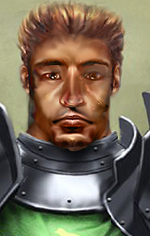
Okay I have spent the past 2 hours doing this...I like it though it does look a bit odd for some reason...it is an attempt to take the helmet off Ajantis and show him in a different pose:
 Jastey I know will have some comments...probably about hair colour or something! 
|
|
|
|
|
Mar 28 2005, 10:27 PM
Post
#44
|
|
|
The Raven Mod Developer Posts: 590 Joined: 4-September 04 From: California, USA |
QUOTE(Rabain @ Mar 28 2005, 01:25 PM) Jastey I know will have some comments...probably about hair colour or something! As my friends and I would say, ROFLSAUCE. The comment might actually be on the lack of neck, but that's just me. I like those elf portraits as well. Especially the male. It seems pretty difficult to get male elf portraits, as well  The female portrait does have one slight problem. The...err...gem(?) in the helm is kind of different then the rest. -------------------- And can we finally say that the bhaal spawn idea has had the final nail hammered in its coffin?
Member of the World Transition Project And the raven, never flitting, still is sitting, still is sitting On the pallid bust of Pallas just above my chamber door; And his eyes have all the seeming of a demon's that is dreaming, And the lamp-light o'er him streaming throws his shadow on the floor; And my soul from out that shadow that lies floating on the floor Shall be lifted - nevermore! Like dealing with terrorists by giving them explosives |
|
|
|
|
Mar 28 2005, 10:50 PM
Post
#45
|
|
|
GOD Retired team member Posts: 1728 Joined: 14-July 04 From: Ireland |
I think the neck is fine, better as it is than too long as most of the other portraits end up being! Armour tends to make guys looks dumpy anyway...
As for the elf girl...it really must be a monitor thing because the gem is one of the few things I actually added to this portrait! I made an effort to try and blend it in, even get the lighting right! I thought her helmet was lacking something. perhaps I need to darken it down some more (the gem) or perhaps just get rid of the white dot on it which tends to draw the eye to it. the next portrait will be a topless one so no one will be distracted by minor inconsistencies like gems and such... 
|
|
|
|
|
Mar 28 2005, 10:54 PM
Post
#46
|
|
|
The Raven Mod Developer Posts: 590 Joined: 4-September 04 From: California, USA |
You're right, it looks like it's the white dot that does it.
I'm looking forward to this topless one. No lopsidedness, mm k? 
-------------------- And can we finally say that the bhaal spawn idea has had the final nail hammered in its coffin?
Member of the World Transition Project And the raven, never flitting, still is sitting, still is sitting On the pallid bust of Pallas just above my chamber door; And his eyes have all the seeming of a demon's that is dreaming, And the lamp-light o'er him streaming throws his shadow on the floor; And my soul from out that shadow that lies floating on the floor Shall be lifted - nevermore! Like dealing with terrorists by giving them explosives |
|
|
|
|
Mar 29 2005, 12:12 AM
Post
#47
|
|
|
Forum Member Posts: 1366 Joined: 22-August 04 From: Germany |
QUOTE(Rabain @ Mar 28 2005, 11:25 PM) Jastey I know will have some comments...probably about hair colour or something! First let me say that it's great to see you dealing with Ajantis alternate portraits! I have to admit that I have some problems with the picture, it looks somehow wrong. (The fact that he looks totally different than I thought is another thing  ) )My comments: His left eye lacks some contrast, expecially compared to the other one. (What is his eye colour? His right eye seems to be blue, and the left one appears brown on my display.) The head is a bit too short, starting from the eyebrows: I would expect his forehead to be longer/ wider (being so short makes him look a bit dull, if you know what I mean.) His chin is very unique... maybe soften the angular shape a bit (I don't mean making him more feminine, though.) Another point is the armour: If the green one is supposed to be a coat, I would expect it to be on top of the armour. The way it is right now it looks as if he is only wearing a metal necklace or something. I'm very tired now so sorry if the post is a bit short. |
|
|
|
|
Mar 29 2005, 08:04 AM
Post
#48
|
|
|
GOD Retired team member Posts: 1728 Joined: 14-July 04 From: Ireland |
If you look at the original you can just about see he has brown eyes. Because he is not looking at the camera in the original I had to steal somebody elses eyes! I can improve the colour, I am in work right now and it does look odd...the monitor thing again!
His forehead was a lot larger but I thought he looked like a half-orc so I shorteneed it, this can be fixed also! I can lengthen his neck too..but it will look odd...I swear. With the armour, this is the way knights armour works, you wear chainmail underneath, then a tabard (which is the green above, it usually has the symbol of your order or house on it) and then shoulder or neck plate. This was the norm for mounted knights. |
|
|
|
|
Mar 29 2005, 08:04 AM
Post
#49
|
|
|
Forum Member Posts: 1366 Joined: 22-August 04 From: Germany |
Now at this monitor the eye looks better than at my display at home.
Just in case you can't see what I was talking about.EDIT: Didn't see your post. QUOTE I can lengthen his neck too..but it will look odd...I swear. I think I have no problem ( ) with his neck, it was Awake who said it's short (I think) QUOTE With the armour, this is the way knights armour works Ah, OK, then make it a golden colour, please. (Ilvastarr's family coat of arms: http://www.nctimes.net/~bryonw/heraldry-ilvastarr.htm )
This post has been edited by jastey: Mar 29 2005, 08:36 AM |
|
|
|
|
Mar 29 2005, 08:23 PM
Post
#50
|
|
|
GOD Retired team member Posts: 1728 Joined: 14-July 04 From: Ireland |
Version2
 Jastey if you have a nice dragon head I could either put it on this armour or onto the orange tabard but the Family Coat of Arms on that link you gave is just so bad it's not worth it...I get the colours and the idea but I can't really see any Ilvastar going around with a dragon that badly drawn on their shields/armour/clothes! Maybe there is a decent dragon head in the Draconimicon? Any colour dragon will do as I can recolour it! |
|
|
|
|
Mar 29 2005, 08:34 PM
Post
#51
|
|
|
Forum Member Posts: 1366 Joined: 22-August 04 From: Germany |
Now his eyes look weird... I like his chin better now though.
I very much like the nose now, it is better than in version one. Could you: Try the eyes again (sorry, but I would like to see them a bit further down, and they look very reddish) Shorten his face between eye and mouth a bit make his neck a bit thinner (especially on his right side, the neck is even thicker than his head) EDIT: I'm not too sure about that though... I think what disturbes me is more the baggy on his left cheek... If you know what I mean  Give him a tiny bit longer hair? *hopes Rabain doesn't loose interest in this because of all the demands and nit-picking* For the Family Coat of Arms: Yes, sorry, the link was more meant to give you an idea about what I'm talking about, I will have a look around. Sir-Kill actually made a BAM for BG1NPC project, maybe he has some better version. |
|
|
|
|
Mar 29 2005, 08:50 PM
Post
#52
|
|
|
GOD Retired team member Posts: 1728 Joined: 14-July 04 From: Ireland |
QUOTE Now his eyes look weird... I like his chin better now though. I very much like the nose now, it is better than in version one. Its his very own original eyes and chin and nose...dragged into perspective! Eyes are tricky because alot of what you see in someone's face is down to the eyes...very unique part of the face. It's kind of hard to imagine what the original would look like face on, getting distances right is hard... The orginal: 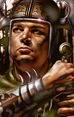 he is quite "chubby" if you look closely...he almost has a second chin! Usually when you lift your head up you stretch any fat you have under your chin and you look less fat...he probably does have a double chin...all that Ilvastar food! But seriously...I'll try lightening the eyes a little (they are red from all the crying he does over changes to his portrait!) and merging the red with the skin tone. Kinights have thick necks...from having to carry heavy helmets on their heads a lot! Do you think he would look better with a different hair colour? |
|
|
|
|
Mar 29 2005, 09:01 PM
Post
#53
|
|
|
Forum Member Posts: 1366 Joined: 22-August 04 From: Germany |
I am curious what you will do with the eyes. The "lower half" of his face on your 2nd version I like very much, and it is in good resemblence to the original portrait (where he is quite chubby indeed...) But the eyes should be a bit down / nose shorter imo. Guess they will stay red from crying.
As I already said the neck is OK. For some reason I always imagined him to have dark hair. (That was no answer to your question but hey!) |
|
|
|
|
Mar 29 2005, 09:53 PM
Post
#54
|
|
|
GOD Retired team member Posts: 1728 Joined: 14-July 04 From: Ireland |
I;m not sure if these are better...definately better portraits than the others...but are they Ajantis?
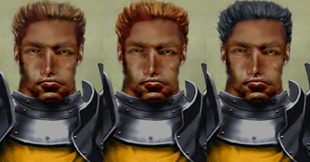 More Ajantis'ssss than you can shake a stick at! |
|
|
|
|
Mar 30 2005, 12:42 PM
Post
#55
|
|
|
Forum Member Posts: 1366 Joined: 22-August 04 From: Germany |
Cool, they are much better. I made the rule for myself not to nagg on pictures more than three times, so here I go (third and last time):
I very much like the chin and mouth. I would even say they "are Ajantis", compared to the BioWare pic. The "baggy" is gone, looks very good. I still have problems with the eyes... For me they look too small, and the white is not white but still very reddish, as if he was awake all night (yes, of course that is something that could happen to a knight easily)... maybe also giving him some lighty spots into his pupils. For Ajantis, I think his nose is too long (but for a portrait, it is OK.) but I can only really tell if I see a version with changed eyes. Something I only noticed now: his chin goes over the metal nacklace he is wearing (don't know the right term for it), making it look as if he gets the collar into his chin/neck all the time (looks rather uncomfortable). On his right side, the hair line looks a bit strange, not sure if this is meant to be a shadow or if he is just a bit assymmetrically haired... I very much like the facial expression, all knightly and such. I like the left version best, in the middle it looks as if he had dyed his hair, and in the right version.. Well... If I haven't talked away all of your motivation, I really would love to see the left version with "bigger" eyes, placed in a way that the upper lid is at the same place as it is for his eyes right now (...if you know what I mean..) |
|
|
|
|
Apr 1 2005, 09:21 PM
Post
#56
|
|
|
GOD Retired team member Posts: 1728 Joined: 14-July 04 From: Ireland |
Okay I promised some topless portraits...these were done in the dark because the...er...models were a little shy:
Disclaimer: if you are under the age of 18 or in any way offended by the sight of naked human flesh please do not click on the links below!  Topless Lady Portrait Topless Man Portrait More detail is available on request...for those of legal age..only! 
|
|
|
|
|
Apr 1 2005, 10:08 PM
Post
#57
|
|
|
consiglieri  Member of Graphics Dept. Posts: 2343 Joined: 13-August 04 From: Michigan, U.S.A. |
sexy!
-------------------- |
|
|
|
|
Apr 2 2005, 01:49 AM
Post
#58
|
|
|
The Raven Mod Developer Posts: 590 Joined: 4-September 04 From: California, USA |
Great job! I especially like the fact that the links seem to be backwards... Or are they set that way as in man portrait for men to click on and vice versa?
-------------------- And can we finally say that the bhaal spawn idea has had the final nail hammered in its coffin?
Member of the World Transition Project And the raven, never flitting, still is sitting, still is sitting On the pallid bust of Pallas just above my chamber door; And his eyes have all the seeming of a demon's that is dreaming, And the lamp-light o'er him streaming throws his shadow on the floor; And my soul from out that shadow that lies floating on the floor Shall be lifted - nevermore! Like dealing with terrorists by giving them explosives |
|
|
|
|
Apr 2 2005, 06:50 PM
Post
#59
|
|
|
GOD Retired team member Posts: 1728 Joined: 14-July 04 From: Ireland |
QUOTE(Awake @ Apr 2 2005, 02:49 AM) Great job! I especially like the fact that the links seem to be backwards... Or are they set that way as in man portrait for men to click on and vice versa?Yeah I knew most guys would go for the girl first and vice versa...tricksy tricksy me!
|
|
|
|
|
Apr 6 2005, 10:34 PM
Post
#60
|
|
|
GOD Retired team member Posts: 1728 Joined: 14-July 04 From: Ireland |
Just a quickie for tonight:
 It took a while to get rid of that "photo" feel from the guys face. Well at least I hope it isn't too photo like! 
|
|
|
|
|
2 User(s) are reading this topic (2 Guests and 0 Anonymous Users)
0 Members:
 |
Lo-Fi Version | Time is now: 20th September 2024 - 06:43 PM |