| The Black Wyrm's Lair Terms of Use |
 Help Help
 Search Search
 Members Members
 Calendar Calendar
|

  |

 Mar 11 2005, 01:09 PM Mar 11 2005, 01:09 PM
Post
#21
|
|
|
GOD Retired team member Posts: 1728 Joined: 14-July 04 From: Ireland |
I think with the shoulders that straight he no longer looks as muscular and his head looks a lot smaller compared to his body!
Jastey was right about his neck too...it almost looks like there is someone with bigger shoulders standing directly behind him! (not just yours but my version too!) I guess he is just a freak! 
|
 |
|


|
Mar 11 2005, 01:39 PM
Post
#22
|
|
|
consiglieri  Member of Graphics Dept. Posts: 2343 Joined: 13-August 04 From: Michigan, U.S.A. |
well he is missing the top of his dome, but it might be a bit more proportional.
-------------------- |
|
|
|
|
Mar 20 2005, 10:34 AM
Post
#23
|
|
|
GOD Retired team member Posts: 1728 Joined: 14-July 04 From: Ireland |
Hi Guys,
So I have finally gotten around to creating a BWish Portraits page for my edits: Rabain's Portrait Edits I will add more as I get them done. Enjoy! |
|
|
|
|
Mar 20 2005, 09:23 PM
Post
#24
|
|
|
Forum Member Posts: 1366 Joined: 22-August 04 From: Germany |
I'm looking foreward to seeing more added from time to time.
 Deathsangel made a good choice there: Pity that one is taken! Just a comment: It would be nice to see the reserved ones without the red cross, too. I think if you write it beneath the picture it should be clear. I like the Sir Neht one very much! |
|
|
|
|
Mar 20 2005, 10:21 PM
Post
#25
|
|
|
GOD Retired team member Posts: 1728 Joined: 14-July 04 From: Ireland |
The thing is I don't want people using the images that are reserved but I want them to be able to see what can be done so this is my trade off. You can see enough of the image to get the idea but unless you are decent enough with photoshop or some other editor the red X should be enough of a turn off.
Okay here is tonight's effort (aptly called midnight), what I need feedback on is which looks better to you, left or right? I am having a bit of a problem these days deciding as several people have commented on portraits needing to be darker but they look just fine to me. My vote goes with the left one but perhaps this looks too bright on your monitor (?) ...let me know. 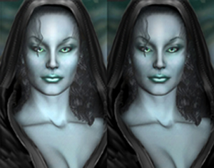 if only they were twins... |
|
|
|
|
Mar 20 2005, 10:26 PM
Post
#26
|
|
|
Forum Member Posts: 1366 Joined: 22-August 04 From: Germany |
The pics are both about the same brightness on my display, but the left one has a little higher contrast, which makes her look as if she stands in a spot light of some sort. But, due to that, the left one looks more interesting and it is not too bright.
Nice work!
|
|
|
|
|
Mar 20 2005, 11:37 PM
Post
#27
|
|
|
consiglieri Member of Graphics Dept. Posts: 2343 Joined: 13-August 04 From: Michigan, U.S.A. |
the lips and neck are too bright on the left, so I say right
-------------------- |
|
|
|
|
Mar 25 2005, 12:21 AM
Post
#28
|
|
|
GOD Retired team member Posts: 1728 Joined: 14-July 04 From: Ireland |
Okay then here is tonights effort:
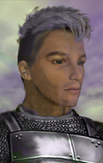 I'm not too sure about the armour against the skin ( I use the smudge tool too much!) |
|
|
|
|
Mar 25 2005, 12:33 AM
Post
#29
|
|
|
consiglieri Member of Graphics Dept. Posts: 2343 Joined: 13-August 04 From: Michigan, U.S.A. |
looks good! I see what you are talking about it kind of looks like the shirt/padding is showing, I say leave it.
have you tried the soften brush/tool instead of smudge, it does not push the color around
-------------------- |
|
|
|
|
Mar 25 2005, 08:27 AM
Post
#30
|
|
|
GOD Retired team member Posts: 1728 Joined: 14-July 04 From: Ireland |
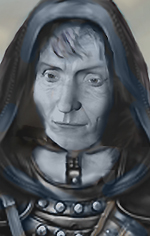
It's weird, I am looking at this at work and I can see much more detail than I can on my monitor at home, that whole area on his right shoulder (his left) is black, I can't see the strap going over the shoulder like I can here!
I tried to make a purple hue on the left side of his face (your right) and it just looks like a poor attempt at staying inside the border (like a 5 year old with a crayon) Oh and the shirt looks like it sticks out (which I cannot see at home at all as this area is completely dark). Looks like i need a new monitor as all the brightness/contrast settings are on high at home (or new drivers for my card? anyone know if this makes a difference to such things?) I haven't really experimented with many of the tools yet in photoshop, I must give that a go, thanks! |
|
|
|
|
Mar 26 2005, 01:26 AM
Post
#31
|
|
|
GOD Retired team member Posts: 1728 Joined: 14-July 04 From: Ireland |
I can't really say this is something I have made up as I have changed very little. I shortened her neck somewhat so I could get her bust into the portrait (ahem!) though it still looks fairly long but it kind of fits with the body as seen in the original below.
Unfortunately with BG portraits you don't get to see much of the rest of the body to give you proper proportions (and man does she have proportions...) 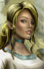 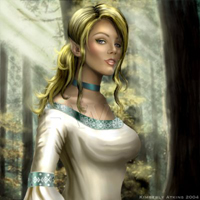 kudos to the original artist Kimberley Atkins for a portrait that doesn't really need alteration! |
|
|
|
|
Mar 26 2005, 02:32 PM
Post
#32
|
|
|
GOD Retired team member Posts: 1728 Joined: 14-July 04 From: Ireland |
And in total contrast to the above:
 Matron Mother says..."Come here you young surfacer and I'll teach you something you won't soon forget. You'll have the marks of the Drow Lust Pits on your skin for the rest of your short life!" from this: 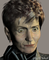
|
|
|
|
|
Mar 26 2005, 07:10 PM
Post
#33
|
|
|
consiglieri Member of Graphics Dept. Posts: 2343 Joined: 13-August 04 From: Michigan, U.S.A. |
intresting, it does fit in with a matron mother, are you coing to color it?
-------------------- |
|
|
|
|
Mar 26 2005, 07:36 PM
Post
#34
|
|
|
GOD Retired team member Posts: 1728 Joined: 14-July 04 From: Ireland |
Er...that was the coloring!
I recoloured the skin using a drow skin tone from another BG portrait...and got rid of the brown leather straps and made them grey/brown instead. I guess it does look black and white, I could probably make her skin more purple to make it look less black and white...how does it look now ^ ? |
|
|
|
|
Mar 26 2005, 08:00 PM
Post
#35
|
|
|
consiglieri Member of Graphics Dept. Posts: 2343 Joined: 13-August 04 From: Michigan, U.S.A. |
yeah, yeah, thats much better
-------------------- |
|
|
|
|
Mar 27 2005, 07:31 PM
Post
#36
|
|
|
GOD Retired team member Posts: 1728 Joined: 14-July 04 From: Ireland |
Thanks SK!
This is one I did yesterday...I'm not too sure about it...perhaps it is because I pulled together 3 distinctly different images to get this. I was looking for something a little different to the normal armour/leather/hood portraits (it is just so easy to use existing portraits as a base...too easy). Anyway here she is, could easily be made into an elf by pointing the ears: 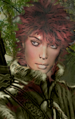 and the original: 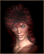
|
|
|
|
|
Mar 27 2005, 08:23 PM
Post
#37
|
|
|
The Raven  Mod Developer Posts: 590 Joined: 4-September 04 From: California, USA |
QUOTE(Rabain @ Mar 25 2005, 05:26 PM) I can't really say this is something I have made up as I have changed very little. I shortened her neck somewhat so I could get her bust into the portrait (ahem!) though it still looks fairly long but it kind of fits with the body as seen in the original below. Unfortunately with BG portraits you don't get to see much of the rest of the body to give you proper proportions (and man does she have proportions...) kudos to the original artist Kimberley Atkins for a portrait that doesn't really need alteration! Well, I like it. I would actually like to steal that one, if I may. I have a few elves(a whole city...) that need portraits, and I have been searching for a good female elf for a while now. May I reserve this one, please? BTW, you're doing a great job, and I really like those drows that you did on the last page(I think). I never got around to posting it, but I loved your St. Patty's day portrait as well. Nicely done 
-------------------- And can we finally say that the bhaal spawn idea has had the final nail hammered in its coffin?
Member of the World Transition Project And the raven, never flitting, still is sitting, still is sitting On the pallid bust of Pallas just above my chamber door; And his eyes have all the seeming of a demon's that is dreaming, And the lamp-light o'er him streaming throws his shadow on the floor; And my soul from out that shadow that lies floating on the floor Shall be lifted - nevermore! Like dealing with terrorists by giving them explosives |
|
|
|
|
Mar 27 2005, 10:37 PM
Post
#38
|
|
|
Forum Member Posts: 1366 Joined: 22-August 04 From: Germany |
QUOTE(Rabain @ Mar 25 2005, 02:21 AM) Okay then here is tonights effort: I'm not too sure about the armour against the skin ( I use the smudge tool too much!) What I'm missing here is more light and shadow in the face, compared to the shiny armour. Of course a polished armour shines more brightly than a face but still I would assume that the light source that lets the armour shine should light the face a bit more, too. (I guess I see it more light than you do on your monitor at home...) Otherwise the pic is great, no comments on proportions and stuff. Blonde elf: smile.gif Cute. Well, I guess I could make some comments on proportions here but I don't want to sound jelous. tongue.gif Matron mother: I like the pic, I think the colours are matching for underworld (and I never thought it's black and white), yet I have problems to see the face as a drow face - looks like an old human woman to me (I don't know, the nose? The eyes? I would imagine drow to look more "elfish", whatever that means...) Red haired woman from yesterday: What I don't like here are the colours of the picture, they look a bit surreal. Everything else is great, the coat (something special indeed), and the woman itself, no critical comments there. smile.gif This post has been edited by Sir-Kill: Mar 28 2005, 09:15 PM |
|
|
|
|
Mar 27 2005, 11:06 PM
Post
#39
|
|
|
Master of energies  Council Member Posts: 3316 Joined: 9-July 04 From: Magyarország |
The blonde girl is nice! The old woman will be a perfect portrait for a drow matron.
As far as the red-haired woman is concerned, I have to agree with jastey. The picture is not plastic, not natural enough. However, I must add that the source picture in advance doesn't look too ideal for further editing. -------------------- Mental harmony dispels the darkness.
|
|
|
|
|
Mar 27 2005, 11:28 PM
Post
#40
|
|
|
GOD Retired team member Posts: 1728 Joined: 14-July 04 From: Ireland |
QUOTE Awake: Well, I like it. I would actually like to steal that one, if I may. I have a few elves(a whole city...) that need portraits, and I have been searching for a good female elf for a while now. May I reserve this one, please? She's yours then...I've already had my...way with her! I'll be working on more elves soon, if you want to suggest some types I'll have look around for some decent faces to portraitify (?) QUOTE Jastey: What I'm missing here is more light and shadow in the face, .......(I guess I see it more light than you do on your monitor at home...) Otherwise the pic is great, no comments on proportions and stuff. Yeah the old monitor thing is doing my head in, I darken the images down a good bit before posting them just to avoid this for others though they look very dark on my screen! I like the proportions here too, thanks! QUOTE Jastey: Red haired woman from yesterday: What I don't like here are the colours of the picture, they look a bit surreal. Everything else is great, the coat (something special indeed), and the woman itself, no critical comments there. Baronius: As far as the red-haired woman is concerned, I have to agree with jastey. The picture is not plastic, not natural enough. However, I must add that the source picture in advance doesn't look too ideal for further editing. I think a lot of the problem is because I made the coat green, perhaps I should add some brown on the fur to accentuate it a bit more (?) Overall I like the high collar on this coat, it is kind of stylish too! Oh and there are some arrows sticking out of a quiver on her shoulder..can people see that...it just looks like a black lump on my screen..how about yours? Thanks all for the comments...suggestions are welcome (for both new portraits and changes to existing) or if you happen to come across some good headshots on your web travels point me towards them! |
|
|
|
|
1 User(s) are reading this topic (1 Guests and 0 Anonymous Users)
0 Members:
 |
Lo-Fi Version | Time is now: 19th September 2024 - 06:41 PM |