| The Black Wyrm's Lair Terms of Use |
 Help Help
 Search Search
 Members Members
 Calendar Calendar
|


 Mar 6 2005, 12:51 AM Mar 6 2005, 12:51 AM
Post
#1
|
|
|
GOD Retired team member Posts: 1728 Joined: 14-July 04 From: Ireland |
I have been messing around with Photoshop all day...I guess I am a little obsessed with portraits at the moment.
Anyway to take my mind off choosing portraits for NPC mods I have done the following. Each image is taken from various locations around the net, mainly Poser art sites. The armour and such are various cobbling together of bits and pieces from BG2 armour and some other BG2 portraits already available. Let me know what you think: 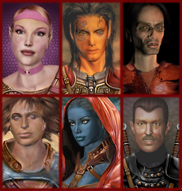 Top-Left - she wasn't so pink, didn't have the elf ears, didn't have that birth-mark/tattoo type thing and didn't have the armor. Top-Middle - he didn't have any armor, no clothes at all in fact, didn't have the tattoo or the elfish ears and the hair was so dark you almost couldn't see it at all! Top-Right - all this guy had was a face and only about half the neck you see now. I extended the neck and added the worn armor. Might make a decent villain. Bottom-Left - again this guy was just head and short neck. I added the armor, recoloured it blue and red tint, lengthened his neck using the smudge tool. Also he was paler than the elf girl above so I gave him a tan by using a skin graft from another portrait and smudge it in. There is still something odd about this one..the eyes? Bottom-Middle - she wasn't a drow and had no clothes on! I think the leather straps might still need some touching up...but don't they always! Bottm-Right: he was just a head wearing a black polo neck, I had to give him a different background to highlight his hair, added the armour which fitted nice with the polo, copied the sword handle to the left side. Might make a decent Armsmaster for some Duke. Gave him the scaring too. |
 |
|


 |
Replies
|
Mar 20 2005, 10:21 PM
Post
#2
|
|
|
GOD Retired team member Posts: 1728 Joined: 14-July 04 From: Ireland |
The thing is I don't want people using the images that are reserved but I want them to be able to see what can be done so this is my trade off. You can see enough of the image to get the idea but unless you are decent enough with photoshop or some other editor the red X should be enough of a turn off.
Okay here is tonight's effort (aptly called midnight), what I need feedback on is which looks better to you, left or right? I am having a bit of a problem these days deciding as several people have commented on portraits needing to be darker but they look just fine to me. My vote goes with the left one but perhaps this looks too bright on your monitor (?) ...let me know. 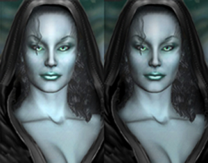 if only they were twins... |
|
|
|
Posts in this topic
Rabain Portrait Obsession Mar 6 2005, 12:51 AM Baronius NULL Mar 6 2005, 06:06 PM Awake NULL Mar 6 2005, 06:30 PM Rabain NULL Mar 6 2005, 07:22 PM jastey NULL Mar 6 2005, 11:02 PM Rabain NULL Mar 8 2005, 10:39 PM jastey NULL Mar 9 2005, 01:07 PM Rabain NULL Mar 9 2005, 07:29 PM jastey NULL Mar 9 2005, 07:58 PM Rabain NULL Mar 9 2005, 08:38 PM Awake NULL Mar 9 2005, 10:34 PM Rabain NULL Mar 9 2005, 11:38 PM Sir-Kill NULL Mar 10 2005, 02:41 AM jastey NULL Mar 10 2005, 08:29 AM Rabain NULL Mar 10 2005, 12:51 PM jastey NULL Mar 10 2005, 01:06 PM Rabain NULL Mar 10 2005, 11:14 PM egm NULL Mar 11 2005, 12:13 AM jastey NULL Mar 11 2005, 08:53 AM Sir-Kill NULL Mar 11 2005, 12:56 PM Rabain NULL Mar 11 2005, 01:09 PM Sir-Kill NULL Mar 11 2005, 01:39 PM Rabain NULL Mar 20 2005, 10:34 AM jastey NULL Mar 20 2005, 09:23 PM jastey NULL Mar 20 2005, 10:26 PM Sir-Kill NULL Mar 20 2005, 11:37 PM Rabain NULL Mar 25 2005, 12:21 AM Sir-Kill NULL Mar 25 2005, 12:33 AM Rabain NULL Mar 25 2005, 08:27 AM Rabain NULL Mar 26 2005, 01:26 AM Rabain NULL Mar 26 2005, 02:32 PM Sir-Kill NULL Mar 26 2005, 07:10 PM Rabain NULL Mar 26 2005, 07:36 PM Sir-Kill NULL Mar 26 2005, 08:00 PM Rabain NULL Mar 27 2005, 07:31 PM Awake NULL Mar 27 2005, 08:23 PM jastey NULL Mar 27 2005, 10:37 PM Baronius NULL Mar 27 2005, 11:06 PM Rabain NULL Mar 27 2005, 11:28 PM Awake NULL Mar 28 2005, 12:27 AM Rabain NULL Mar 28 2005, 06:55 PM Rabain NULL Mar 28 2005, 09:25 PM Awake NULL Mar 28 2005, 10:27 PM Rabain NULL Mar 28 2005, 10:50 PM Awake NULL Mar 28 2005, 10:54 PM jastey NULL Mar 29 2005, 12:12 AM Rabain NULL Mar 29 2005, 08:04 AM jastey NULL Mar 29 2005, 08:04 AM Rabain NULL Mar 29 2005, 08:23 PM jastey NULL Mar 29 2005, 08:34 PM Rabain NULL Mar 29 2005, 08:50 PM jastey NULL Mar 29 2005, 09:01 PM Rabain NULL Mar 29 2005, 09:53 PM jastey NULL Mar 30 2005, 12:42 PM Rabain NULL Apr 1 2005, 09:21 PM Sir-Kill NULL Apr 1 2005, 10:08 PM Awake NULL Apr 2 2005, 01:49 AM Rabain NULL Apr 2 2005, 06:50 PM Rabain NULL Apr 6 2005, 10:34 PM jastey NULL Apr 7 2005, 07:44 AM Rabain NULL Apr 7 2005, 06:01 PM Rabain NULL Apr 12 2005, 09:57 PM Rabain NULL Apr 22 2005, 07:28 PM Baronius NULL Apr 22 2005, 07:53 PM Rabain NULL Apr 24 2005, 10:26 PM Rabain NULL May 6 2005, 10:18 PM Rabain NULL May 6 2005, 11:44 PM Sir-Kill NULL May 7 2005, 12:35 AM Rabain NULL May 9 2005, 08:17 PM dragon_lord NULL May 10 2005, 12:03 PM Rabain NULL May 10 2005, 06:09 PM jastey NULL May 10 2005, 07:25 PM Rabain NULL May 10 2005, 09:00 PM Rabain NULL May 10 2005, 09:12 PM dragon_lord NULL May 10 2005, 11:00 PM Rabain NULL May 11 2005, 07:20 AM jastey NULL May 13 2005, 10:26 AM Rabain NULL May 13 2005, 10:51 AM Rabain NULL May 14 2005, 08:06 PM Sir-Kill NULL May 14 2005, 08:21 PM Rabain NULL May 14 2005, 10:55 PM Baronius NULL May 14 2005, 11:02 PM jastey NULL May 15 2005, 10:51 PM Rabain NULL May 16 2005, 09:19 PM Baronius NULL May 17 2005, 12:10 PM Rabain NULL Jun 17 2005, 09:51 PM Rabain NULL Jun 18 2005, 12:31 PM Sir-Kill NULL Jun 18 2005, 09:01 PM Rabain NULL Jun 18 2005, 09:57 PM Rabain NULL Jul 11 2005, 07:38 PM Lord-Jyssev NULL Jul 22 2005, 07:41 AM Rabain NULL Aug 11 2005, 08:24 PM Sir-Kill NULL Aug 11 2005, 11:17 PM Rabain NULL Aug 12 2005, 10:34 PM Baronius NULL Aug 12 2005, 11:10 PM Rabain NULL Aug 13 2005, 02:25 PM Baronius NULL Aug 13 2005, 02:30 PM Rabain NULL Aug 13 2005, 03:08 PM
 Baronius NULL Aug 13 2005, 04:00 PM
 |
1 User(s) are reading this topic (1 Guests and 0 Anonymous Users)
0 Members:
 |
Lo-Fi Version | Time is now: 13th May 2026 - 01:32 AM |