Awake
Dec 31 2004, 11:13 PM
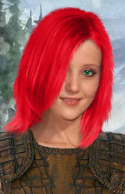
OK, I didn't really have any reason to do these portrait edits, but I did them anyways.
The first image is the same as the second one, just with the hair having a couple of streaks in it.


The portrait at the bottom of this post is the original. Not wonderful edits, but I'm just beginning on portrait edits.
dragon_lord
Jan 1 2005, 01:37 AM
Thats alot better than the last edited portrait you showed me, so keep at it your getting better

. Although the portrait could do with a better background.
Awake
Jan 1 2005, 01:44 AM
Why thank you, dragon_lord. I don't know what to do with the background though. My favorite colors are red and black, so I'm biased when doing any kind of artwork. What would you suggest? Also, I made a couple new versions of the one I posted in our workroom. I'll put the new ones up in a bit.
dragon_lord
Jan 1 2005, 01:56 AM
I have some backgrounds that you might like (I think they look awesome) - they are scanned in from an ad. Do you want me to upload them?
Awake
Jan 1 2005, 02:04 AM
Yeah, sure. Upload them here and I'll post the different versions when I do them. Some practice could never hurt. Scanned from an add, eh?

What else do you think should be done to it?
Baronius
Jan 1 2005, 02:05 AM
Nice work Awake. Really. Don't be so strict with yourself (you say you are beginning, but your portraits tend to show that you improve a lot!)
You also said you had had no reason to edit these portraits: you did have! To improve your graphical skills AND to have fun. If you improve in anything, it means you don't waste the time but spend it in a useful way

I'm not sure about the background either (I am not very fond of the current one but I couldn't imagine better either, at the moment). The rotating and other edits (like the hair) are very good.
Keep up the good work!
dragon_lord
Jan 1 2005, 02:45 AM
dragon_lord
Jan 1 2005, 04:03 AM
Awake
Jan 1 2005, 05:52 AM
Hey, those are pretty good. Thanks for the images. Yes, the first three were better than the next three, but they're still good and usable. Now to hopefully get to practice on these. Perhaps I'll steal another portrait from portrait city.
Awake
Jan 1 2005, 06:32 AM
here, using one of the backgrounds that dragon_lord supplied for me, I have given her a castle background and lowered her a little bit so the background is more visible.
dragon_lord
Jan 1 2005, 06:35 AM
Looks really good

, much better with a decent background to it. Some portraits on my site could be improved a fair bit with better backgrounds.
Awake
Jan 1 2005, 06:41 AM

Alright then, I'll start editing all of the portraits on your site... not...
And
another one that I've done. The next one I'm gonna see what else I can add to the portrait. Maybe an item.
Awake
Jan 1 2005, 06:44 AM

Alright then, I'll start editing all of the portraits on your site... not...
And
another one that I've done. The next one I'm gonna see what else I can add to the portrait. Maybe an item.
Awake
Jan 1 2005, 07:51 AM
I have to continuously edit the title of this thread so that the contents make sense. dragon_lord influenced me in IRC to edit the buttons here on the BW forum. So, I edited them. Basically what I did was get rid of all the white borders. Hopefully an admin will see this and get them implemented into the forum. The white borders don't do much for the forum.
Baronius
Jan 1 2005, 12:24 PM
Admin saw it, discussed it with you on chat server, and now they are up!
Awake
Jan 2 2005, 06:49 AM
And it's a wonderful thing too. I keep on looking at the buttons and thinking "If dragon_lord didn't think of that, then we would still be looking at those terrible white borders."
Anyways, here is a drow Haer'dalis. Don't know why I did this. But I did it nonetheless.
Thins I changed:
1) Background
2) Skin color
3) Hair color
4) Made the gold earrings golder
5) Brought more life to the color on the collar of the armor.
6) Tried getting rid of the tatoos
dragon_lord
Jan 2 2005, 07:08 AM
That looks great

. I especially like the gold colouring, it looks awesome with the light grey skin colour. I like him more like that than I do him normally.
Awake
Jan 2 2005, 07:24 AM
Thanks for the compliment, dragon_lord.
Perhaps if I kiss up enough to Baronius he'll switch out my current avatar for this one...
Baronius
Jan 3 2005, 02:06 PM
I support the idea, okay I will bring it to the Council's agenda as a poll, I'm almost 100% sure that everyone will vote Yes.
The poll will exactly sound like this (although phrased in a better way I think): "For Black Wyrm Modders, allow the use of slightly edited (e.g. re-colored) versions of their original portrait choices (from the Black Wyrm Portrait Collection)"
Baronius
Jan 22 2005, 03:47 PM
The Council has accepted it (many days ago, I just forgot about it), now any BW modder (BW modders have blue stars on the forum) can
modify his existing portrait (chosen from the BW Portrait Gallery).

jastey
Jan 22 2005, 05:33 PM
Looks cool, Awake, congrats!

Awake
Feb 18 2007, 03:43 AM
Here's one I did...I'm not sure how long ago...A couple of weeks, maybe. Anyways, figured I'd share it with the public. I meant to fix it up, but I didn't save it with all the layers seperate, and I just couldn't be bothered to start over from the beginning. I'd show the original, but...well, let's just say she wasn't very clothed.


EDIT: What I did was add armor, change the hair color, change the eye color, and add a background. I also got rid of some hair on the left side(to the viewer) that just didn't look good, in my opinion.
RE-EDIT: It's been two years since this thread was posted in. =)
Sir-Kill
Feb 18 2007, 02:07 PM
nice
heh 2 yr. old topic bump
This is a "lo-fi" version of our main content. To view the full version with more information, formatting and images, please
click here.


